Wednesday, December 2, 2009

Final lab!

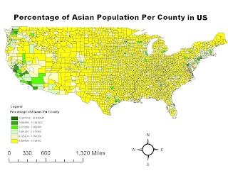
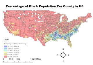
This map above shows the population density of Asians in the United States according the census in the year 2000. As we can see from the map, there are not a lot of Asians that live in the middle portion of the United States, most of them live on the West Coast, however, there are a few states with a high density of Asians on the East Coast as well. The counties with high Asian population density are often clustered together. Also from this map we see that the county with the highest Asian population density is in California, with 30.84 percent. This could be due to the recent high migration patterns of Asians, and since the coast is the most accessible places to arrive, that is where they choose to live. Also, the coastal cities are where the metropolitans are, therefore there is a mixture of different races of people. This map shows the population density of Blacks in the counties of United States. This information is also obtained from the Census in the year 2000. As we can see from this map, the counties with the highest density of Blacks is in the South-eastern part of the United States. The pattern is interesting because there is a whole section of these counties with high population density of Blacks. It is all concentrated within this area near the Mississippi, while everywhere else in the US, there is not a high population density of Blacks. Also from this map we see that the county with the highest percentage of Blacks in its population density has a percentage of 86.49. That is a very high percentage, meaning the overall majority of that specific county is made up of Blacks. Since most of the Blacks are concentrated within the same area, we can infer from this map that they like to stay together in one area.
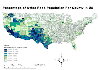
The last map shows the population density of other races in the US. Clearly, the places with high population density of other races are mostly on the West Coast. It is interesting to see this distinct pattern between the east and west from this map. Almost all of the counties with a high density of other races are clustered together. Although almost all the states on the West Coast have a higher density of other races than the East Coast, it is visible that states in the South have a higher density than states in the North. From this map, we can infer that the western part of the US has a higher racial diversity than the eastern part.
I enjoyed doing this lab because it combined all of the things we learned in this class. The tutorial taught us how to incorporate different elements into the map and how to make it look appealing visually. Overall, these maps were useful in showing the ethnic population in the United States. We can see how there is a clear pattern that certain races like to reside in certain areas. Many Asians live on the West Coast since most of them migrated to California during the Gold Rush and the construction of the Transcontinental Railroad. Many Blacks live in the Southern part due to the historical impact of slavery. And since the western part of the US is newer than the eastern side, it has more ethnic diversity. This lab showed how we can use GIS in many aspects and for many purposes. For this lab, we used data from the US Census Bureau to show the ethnic diversity in the United States. Sociologists can use this map to analyze racial distribution in the US.
My overall impression of GIS is that it is very useful in our everyday lives and it is a very interesting class. From this class, I learned how we use GIS in our everyday lives, like when we use Google Maps for directions or when we look at mash-ups of our favorite stores. The part that I did not like about this class was that a lot of the information was new to me, so it was actually pretty difficult. I am sure that most of the students taking this class are actually not Geography majors, but taking this class for a GE. Therefore, most of the terms were new to me and these labs were confusing at times. It got frustrating when I often had to stay in lab for over three hours to finish my lab. Although I will probably never learn more about GIS, I am now more aware of my spatial surroundings. This blog will always be a memory of this class and maybe in 10 or 20 years I'll come back and look at this and be amazed at all the interesting maps I have created.

Thank you Lindsay for always helping me out in lab! :)

Wednesday, November 18, 2009

Lab #7


In the year 2009, Southern California had over 83 wildfires already. However, the most notable fire is the Station Fire in the north of Los Angeles on the Angeles Crest Highway. This fire was the largest and deadliest of the wildfires, which burned 160,577 acres. The Station Fire destroyed 209 structures, including 89 homes, and took the lives of 2 firefighters. The fire was started on August 26th and not fully contained until September 19th. The US government spent over $93.8 million in fighting and containing the flames.
Other than the buildings destroyed, the blaze also threatened 12,000 structures in the Los Angeles County and the Los Angeles County National Forest. Many nearby neighborhoods and communities such as Glendale, Acton, La Crescenta, Pasadena, Littlerock and Altadena were forced to evacuate to escape the flames. The fire threatened television, radio and cellular telephone antennas that provided communication for nearby neighborhoods on the summit of Mount Wilson. Also, the flames threatened the Mount Wilson Observatory which contained historically significant telescopes and expensive astronomical facilities operated by California universities such as UCLA, USC and UC Berkeley. The starting point of the fire was right along the Angeles Crest Highway, causing some major damage to the signs on a 40 mile stretch of the highway. Part of the Angeles Crest Highway have been close since then.
Due to the dry climate in Southern California, wildfires are unpreventable. The high temperatures and strong winds make it hard to extinguish the fires. During the late summer and early fall, temperatures are often as high as 100 degrees with no rain throughout the seasons. Other than natural resources, sometimes fire could be caused by human activity. For the Station Fire in LA, investigators of the fire found a substance at the fire's origin point that was believed to have caused the fire. On September 3rd, officials announced that the fire was caused by arson and have started a homicide investigation to find the people responsible for the damage.
The thematic map that I’ve included above is showing the schools in Los Angeles County. These schools include preschools, elementary schools, middle schools, high schools and universities. Due to the fire, many school districts postponed the starting date of the school year. Two school districts that were right along the borderline of the fire were the La Canada Unified School District and Glendale Unified School District. As you can see from the map, many other schools were in the close proximity of the fire. According to the LA Times, the Pasadena, Saugus, Eastern San Fernando Valley school districts prohibited outdoor activities due to the horrible air quality. Even as far as the school district in San Gabriel warned students about the impact that the bad air quality could have on their health. According to Science Daily and The Boston Globe, there was a great amount of ash and smoke hanging in the air which lifted carbon monoxide more than 27,000 feet into the atmosphere. Most schools near the fire were closed or evacuated. However, since the fire progressed northward, none of the schools were burned down.
This Station Fire lab shows the usefulness of GIS in every aspect of our lives. With arcGIS, experts can predict the spread of the fire to help evacuate the communities around the fire. Also, these maps provide visual images so experts can examine the patterns associated with the fire such as air quality, wind, and elevation. With the thematic maps, like the one I created for schools around the fire, it can be useful to analyze how communities may be affected. The use of maps and spatial analysis can help reduce the damage of natural disasters, although wildfires in Southern California are sometimes inevitable.


Work Cited

City News Service. "Schools remain closed because of Station fire". L.A. Now. Los Angeles Times, 1 Sept. 2009. Web. 23 Nov. 2009. http://latimesblogs.latimes.com/lanow/2009/09/schools-remain-closed-because-of-station-fire.html.

Weikel, Dan (4 September 2009). "Angeles Crest Highway closed indefinitely because of fire". Los Angeles Times, 5 September 2009. Web. 23 Nov. 2009. http://latimesblogs.latimes.com/lanow/2009/09/angeles-crest-highway-closed-indefinitely-because-of-fire.html.

Mapshare. Web. 23 Nov. 2009. http://gis.ats.ucla.edu//Mapshare/Default.cfm.

The National Map Seamless Server. Web. 23 Nov. 2009. http://gis.lacounty.gov.

"InciWeb the Incident Information System: Station Fire." inciweb.org. Web. 23 Nov. 2009. http://inciweb.org/incident/1856/.

Tuesday, November 10, 2009

Lab #6

Maps of The Sierra Madre

Shaded Relief Model
Aspect Map

Slope Map
3-D Model


These images are digital elevation models (DEM) that represent the area around the Sierra Madre in California in UTM zone 11N. I selected this area because since the Sierra Madre is a mountain range, it would have some areas with greater elevations than other areas. This region looked appealing on the elevation map of the United States. The shaded relief map highlights the high and low areas of the area around the Sierra Madre. The lighter blue areas have lower elevation than the dark blue areas. The slope map focuses on the inclination of the land. I finished my slope map before I got the hint that we were supposed to change the z factor from default to 0.001, therefore my slope map is not very significant. Therefore, the slope inclination is not very clear. The aspect map shows what direction certain parts of the map are facing. The red areas are facing north, green facing south, blue facing west, and yellow facing east. The 3D map was my favorite one. It looks really cool! Basically, this map shows the 3-dimensional figure of the Sierra Madre and the areas around it in California. The dark purple areas are the peaks while the yellow areas display the flat lands. The spatial reference I used for this exercise was GCS_North_American_1983. The extent information of the area I picked is as follows:

Top: 34.34017 degrees
Bottom: 33.98703 degrees
Left: -118.40653 degrees
Right: -117.70025 degrees


Wednesday, November 4, 2009

Lab # 5


This lab exercise was really interesting because I got the chance to actually make map projections myself after learning about them in class. After creating the maps in different projections, I started to realize what the professor was talking about when he mentioned how map projections often lead to distortions. Each of these maps brings to attention how relative these maps truly are in relation to the actual distance between Washington D.C. and Kabul. Map projections show the 3-D world in a 2-D image, therefore, there are inaccuracies within each projection. Each map projection requires complex mathematical tools and there is not one that is perfect. Since none of the projections calculated the same distance in miles in this exercise, this proves that projections are often skewed and distorted. Therefore, it is important to know which projection is best for a specific project because each projection preserves a certain aspect.

There are three types of map projections: conformal map projections, equidistant map projections, and equal area map projections. Conformal map projections, like the Mercator projection and Miller Cylindral projection, preserve local angles therefore making them useful for navigational purposes and identifying the shape of continents and countries. Equal area map projections like Bonne projection and Goode Homolosine projection are better at preserving area in relation to one another, therefore they can be used to calculate the area of countries and continents efficiently or measuring and analyzing population density. Equidistant map projections like the Equidistant Conic and Equidistant Cylindrical maps preserve distance, therefore, they are most useful for calculating the distance between two fixed points. It is the best choice to use Equidistant map projections to calculate the distance between Washington, D.C. and Kabul, although the conic projection calculates the distance as 6,729 miles, while the cylindrical projection calculates the distance as 5,051 miles.

Some issues can be related to using map projections. One issue is making sure which map projection to use for the purpose of the project. Each map projection has its pros and cons for specific uses. As seen from this lab exercise of measuring the distance from Washington D.C. to Kabul, I got 10,186 miles from the Mercator projection and 5,052 miles from the Equidistant Cylindrical projection. Each of these distances would be meaningful, as long as it is used in the right context. Another issue is that all these map projections are distorted in a way. In most cases, the areas around the equator is preserved and as one gets further away from the equator, the distortions increase. For example, since Antarctica is far away from the equator, its size is disproportionately large in the Mercator projection.

Map projections also have a lot of potential. For example, each map projection gives us a different perspective of the same features on a world map that we would not normally see. They can be used to analyze the world around us in many different ways. Also, map projections are easy to read and practical. For example, one can use a conformal map to plan a trip from Long Beach to Cabo on a ship by using a Mercator projection or any other type of conformal projections. Therefore, map projections are useful in our everyday lives. Although globes can display the world in 3-D without distorting distance ratios or the shape, maps are a lot more portable and accessible.

Tuesday, November 3, 2009

Lab #4

My experience with ArcGIS was quite interesting. The first time around, I found everything really confusing and frustrating. I felt like this lab was just a test of my patience and ability to follow directions. I had to follow the directions very carefully to ensure that I did not make any mistakes. For example, for the first exercise, I forgot to change the scale on the map from feet to miles. I did not realize I made that mistake until the end and I was not very familiar with the application so I did not know how to go back and fix it. I felt like it was really easy to miss some steps as well when I scrolled down the pages. This application also felt really time consuming since the it took me almost 3 hours to go through the tutorial the first time. I realized that GIS was not as easy as I expected it to be, and this ArcGIS application was a lot more complicated than the computer programs that I am familiar with.
However, this application amazed me in many ways. First of all, the tutorial was very helpful, despite how frustrating it was in the beginning. It got easier the second and third time around when I got used to using the application and became familiar with where the buttons were located. The tutorial was very user-friendly since the directions were clear, and it even had pictures showing exactly what the steps should look like on the computer. Because I am interested in geography and I enjoy looking at maps, I found this lab very enjoyable. It exposed me to a totally different perspective on maps. Now, I realize that creating maps is not as easy as I thought it would be. It takes a lot of time and effort. Other than that, I think these maps created from GIS can be very useful to geographers and landscapers because they can use these maps to analyze spatial relationships easily. Also, the part I thought was interesting is how there can be many layers embedded within each map. This feature can be useful to see the relationships between each layer.
There are countless potential for using GIS as we can see from this application. When an individual learns how to use this application, they are able to create maps and images that can display a lot of information. But, these maps can be very overwhelming to someone that has no background in geography. When my friend saw this lab that I was working on, he was amazed by how I was able to create such complex images with ArcGIS. However, for experts, they are able to use this application to create maps that benefit our daily lives. These maps created from GIS can help to visualize and organize a lot of information about our landscape.
Despite its usefulness, there are also some pitfalls that can be associated to GIS and the ArcGIS application. A major pitfall that I have already addressed is how complicated and frustrating this application can be. It is not the easiest computer program to be used by people that are not experts in the field. Because there are so much information being exposed, one can be easily confused and overwhelmed by the amount of information. An individual must have some prior knowledge about geography and computer programming in order to use this application successfully. Another pitfall is that in order to be familiar with the program, an individual must repeat the tutorial many times like we did in lab section. This makes the application very time consuming. This program requires an individual to spend long hours in front of the computer, which often causes a lot of frustration and stress. However, I enjoyed this lab overall!

Wednesday, October 14, 2009

Lab #3

Sanrio Stores in California Mashup for Hello Kitty Lovers!


View Sanrio Stores in California in a larger map

I made this mashup of all the Sanrio stores in California for all the Hello Kitty lovers, since I am one myself. It is interesting to see that in California alone, there are already 48 Sanrio stores. Most of the Sanrio stores are concentrated in urban areas. There are almost no Sanrio stores in the rural areas of California, for example, in Redding, or San Luis Obispo. As one can see from this mashup, many of the icons are overlapping due to the fact that each store is not far from the next one. Many of these stores are within 10 miles of each other. This mashup could be useful for users to find Sanrio stores close to them. Also, there are phone numbers provided for each store so users can call conveniently to see if a product they want is available at a certain store. Enjoy!

Commentary on Neo-geography
Neo-geography has many pitfalls despite its technological advances. First of all, neo-geographical maps are easy to create, therefore, they could be created by any average person. Although this makes neo-geographical maps easily accessible, it also makes these maps unreliable. Since they could be created by anyone, no one can guarantee that the information being exposed is true or current. Also, this leaves the professionals without anything to do. It used to be their jobs to create these geographical maps, which were reliable since they are experts in the field.
Also, there are often negative consequences that follow technological advances. In this case, there are some serious consequences with the easy accessibility of neo-geography. For example, a lot of personal information is being exposed on the internet. With neo-geography, anyone can simply expose personal information about themselves or others in a map and display it publicly on the internet. Therefore, making personal information easily accessible to others. This could lead to potential dangers for any ordinary citizen.
Despite the pitfalls and consequences, there are also many potential of neo-geography. The accessibility of these tools, like Google Maps, makes the internet more democratic. Also, since more people are using these maps on a regular basis, people are more familiar with maps and they are becoming more aware of their surroundings geographically and spatially. Since neo-geography is a new advancement in technology, just like any other technological advancement, it will always have its pros and cons.

Wednesday, October 7, 2009

Lab # 2


1. What is the name of the quadrangle?
The name of the quadrangle is "Beverly Hills" located in California.
2. What are the names of the adjacent quadrangles?
The names of the adjacent quadrangles are Canoga Park, Van Nuys, Burbank, Topanga, Hollywood, Venice and Inglewood.
3. When was the quadrangle first created?
The quadrangle was first created in 1995.
4. What datum was used to create your map?
The datums that were used to create the maps were the North American Datum of 1927 (NAD 27) and the North American Datum of 1983 (NAD 83).
5. What is the scale of the map?The map has a scale of 1:24,000.
6. At the above scale, answer the following:
a) 5 centimeters on the map is equivalent to how many meters on the ground?
5 centimeters on the map is equivalent to around 1,200.912 meters on the ground.
b) 5 inches on the map is equivalent to how many miles on the ground?
5 inches on the map is equivalent to 1.89 miles on the ground.
c) one mile on the ground is equivalent to how many inches on the map?
One mile on the ground is equivalent to 2.64 inches on the map.
d) three kilometers on the ground is equivalent to how many centimeters on the map?
Three kilometers on the ground is equivalent to 12.5 centimeters on the map.
7. What is the contour interval on your map?The contour interval on the map is 20 feet.
8. What are the approximate geographic coordinates in both degrees/minutes/seconds and decimal degrees of:
a) the Public Affairs Building; (34° 4' 27.6954",-118° 26' 21.516")
b) the tip of Santa Monica pier;(34° 0' 27.0714",-118° 29' 59.6754")
c) the Upper Franklin Canyon Reservoir;(34° 7' 16.572",-118° 24' 35.424")
9. What is the approximate elevation in both feet and meters of:
a) Greystone Mansion (in Greystone Park); 560 feet, 170.69 meters
b) Woodlawn Cemetery; 140 feet, 42.47 meters
c) Crestwood Hills Park; 600 feet, 182.88 meters 10. What is the UTM zone of the map?
The UTM zone of the map is zone 11. 11. What are the UTM coordinates for the lower left corner of your map?(3763000, 362000)
12. How many square meters are contained within each cell (square) of the UTM gridlines?
1,000,000 square meters are contained within each cell of the UTM gridlines.
13. Obtain elevation measurements, from west to east along the UTM northing 3771000, where the eastings of the UTM grid intersect the northing. Create an elevation profile using these measurements in Excel (hint: create a line chart). Figure out how to label the elevation values to the two measurements on campus. Insert your elevation profile as a graphic in your blog.
14. What is the magnetic declination of the map?
The magnetic declination is 14°.
15. In which direction does water flow in the intermittent stream between the 405 freeway and Stone Canyon Reservoir?
The water in the intermittent stream is flowing south.
16. Crop out (i.e., cut and paste) UCLA from the map and include it as a graphic on your blog.

Wednesday, September 30, 2009

UCLA Campus

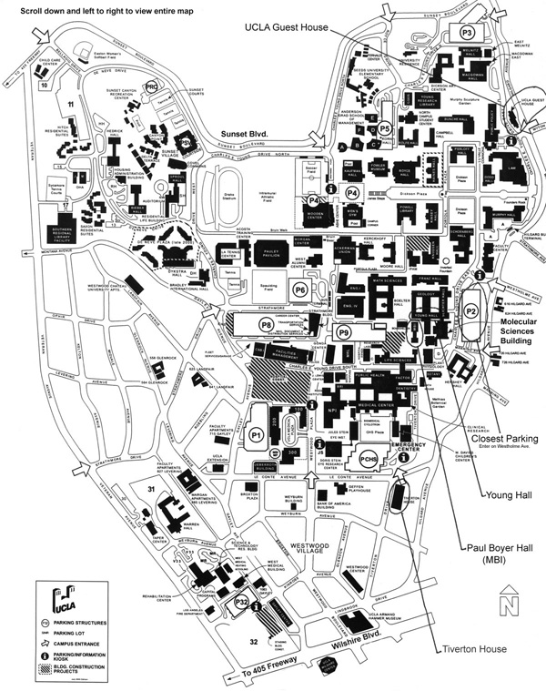
I got this map from the Biochemistry department of UCLA. Looking at the labels that were later added on, I believe this map was used for a conference of some sort for the Biochemistry department. Other than the original UCLA campus map of where each building at UCLA is located, there are labels pointing at the UCLA guest houses and also showing where the closest parking is to the Molecular Sciences Building. This map can be useful for anyone that is unfamiliar with the UCLA campus. It can be a visitor, a parent, or a first year student. It shows where each building is and also where the stadiums and dorms are located.
I find this map interesting because this map is crucial for my university life at UCLA and it is something that I have to work with constantly. When I first arrived at UCLA, I had no idea where any of my classes were. I had to go around campus to find my classrooms before school started so I would not get lost on the first day. This map helps me out a lot because it helps me find all the buildings I need to go to for every lecture and discussion. It still comes in handy even until this day because every quarter I have classes in different places and it is useful to get around campus.

How Taiwan Sees the World


The source of this map is from a group blog called Savage Minds. The blog was created by a group of anthropologists, but they did not draw this map themselves. The creator of this map is unknown, but it shows how Taiwanese people view the world. It might appear stereotypical, but according to the blog, many Taiwanese citizens actually find this map very accurate.
I find this map very interesting because although I am not from Taiwan, I have many Taiwanese friends. It is funny how they are very stereotypical, but I am not trying to say that only Taiwanese people are stereotypical. To some extent, everyone is stereotypical to an extent, and this map clearly demonstrates this fact. For example, on this map, the United States is labeled as the Evil Empire, which is probably due to the fact that United States is known as the most powerful country in the world. However, on the east coast, there is an arrow pointing to where Wang Chien Ming is, who is a famous Taiwanese baseball player that is playing for the Yankees in New York. In a way, this map shows how ignorant people can be, since they are only concerned with their own countries, but other than that, they do not know a lot about the areas that are out of their reach.

Las Vegas Strip

This is a map of the Las Vegas Strip that I found on looktours.com. The map basically shows all the hotels on the Strip in Las Vegas which is located on Las Vegas Blvd in Las Vegas, Nevada. Other than the hotels, the map also shows the main freeway, which is Freeway 15 and the main streets around the Strip. Also, the map shows the location of the McCarran Airport, which is the main airport in the city of Las Vegas. From the map, we can see how most of the hotels are gathered close together on Las Vegas Blvd, while a few other hotels are not located directly on the main street.
I find this map interesting because it shows how many different options of hotels there are for visitors to choose from when they want to visit Las Vegas. I personally enjoy going to Las Vegas a lot, and I have been there many times before. I chose this map because I wanted to familiarize myself with where all the hotels are located since I am going to Las Vegas again next weekend. I want to be able to visit all the hotels on the Strip since all the hotels are well designed and unique from one another.